Exness Rebrands its Logo to Mark 15 Years of Success
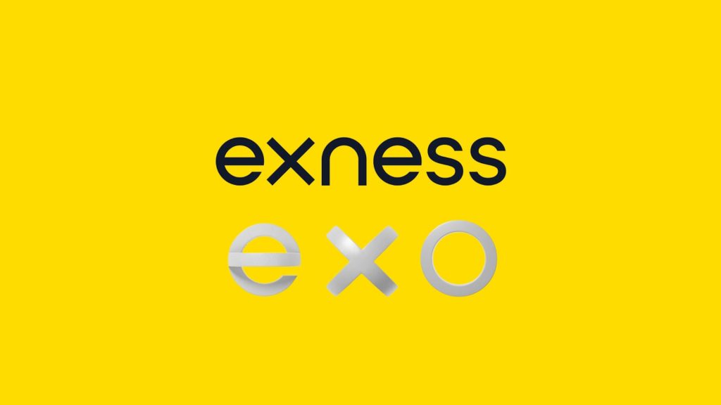
In celebration of its 15th anniversary, Exness, the world’s largest retail broker, has undergone a significant rebranding initiative. This strategic move aims to align the brand with its remarkable journey and position it for the future of trading. The focal point of this transformation is the introduction of a new logo, the EXO, which encapsulates the essence of Exness’ core values and its commitment to innovation.
Exness Rebrands its Logo: Meaning and Design
The new logo brings fresh perspectives to the company’s design, meaning, and thought. Let’s explore its design and significance.
The EXO Meaning
Exness’ new logo features a dynamic symbol called the EXO, which represents the company’s unique methodology. The EXO blends technology and ethics to reshape the trading market, highlighting Exness’ commitment to achieving a perfect equilibrium in all its endeavours.
The EXO rotates to reveal the initials ‘e’ and ‘x,’ which are accompanied by a circle symbolizing the head and an icon representing the heart. The design focuses on harmonizing ‘head’ and ‘heart’ for a better trading experience.
Find the ideal trading and liquidity partners and become a part of the global network of professionals now!
Crafting Precision and Balance
Exness crafted its logo with mathematical precision to reflect its commitment to structural purity. The designer carefully balanced precision and human-centric design in the letters ‘e,’ ‘x,’ and ‘n.’ The logo’s ‘s’ shapes are humanized to enhance readability and bring harmony to the visual identity.
The consistent width and centred crossbar serve as visual cues, reinforcing Exness’ dedication to mathematical precision and user-centric design principles.
About Exness
Established in 2008, Exness has emerged as a pioneering force in the financial industry, revolutionising the world of online trading. Exness is the largest retail broker globally, with over 700,000 active traders, 64,000 partners, and a monthly trading volume of up to $4.8 trillion USD.
Conclusion
Exness has undergone a visual transformation with a refreshed yellow and a new colour palette to enhance user experiences through functional communication and visual intrigue.
Exness has recently rebranded and will integrate its new identity into marketing campaigns, product communications, and upcoming expos. Clients can engage with a new narrative that will shape the future trajectory of this leading financial brand.
Contact us now to reap the maximum benefits from your trading strategies!

